A fresh approach to outdoor exploration
TrailRanger
TrailRanger is an application that aims to help inspire and facilitate outdoor exploration through gamification. The app targets where the target audience's attention is and helps to connect young adults with the outdoors through competitions, challenges, and milestones.

The Problem
In recent years, the disconnection between young adults and the natural world has deepened as our lives increasingly revolve around technology.
Research Question
How can a gamified mobile app be designed to help inspire and facilitate outdoor exploration among 18-24 year olds?

Looking at the core problem, one report conducted on university students across Australia and New Zealand found that 72% of students experience stress weekly, primarily from balancing academic work with other responsibilities. Another study, which targeted young adults aged 18-24, found that 58% of respondents stated being in nature is one of the biggest aids to helping them destress. Despite this nearly half want to be outside more but can't find fun activities.
To gain some more insights into the target audience, I conducted a survey. I discovered that 89% of respondents would like to spend more time outdoors exploring, and that fitness and exploration were the two most common motives for going outdoors among respondents.
The Octalysis Framework
This is an important framework designed to help with understanding and implementing gamification strategies. In this project, these core drives are instrumental in developing features that deeply engage users and provide them with rewarding experiences, encouraging meaningful progress within the app and increased interaction with nature.


Differential Line Growth
This is a pattern created in p5.js, which was used as part of TrailRanger's brand identity. It's a phenomenon seen throughout nature, such as in leaves, fingerprints, fruits, and even the shape of brains. It's used within the TrailRanger brand as a metaphor for connecting with nature and exploring different paths.


Personas and user journeys were created based on primary and secondary research, establishing the target audience's pain points and their desires. This helped to further empathise with the target audience and gain insight into how people would use the app, providing a clear picture of what solutions the app should provide from start to finish.

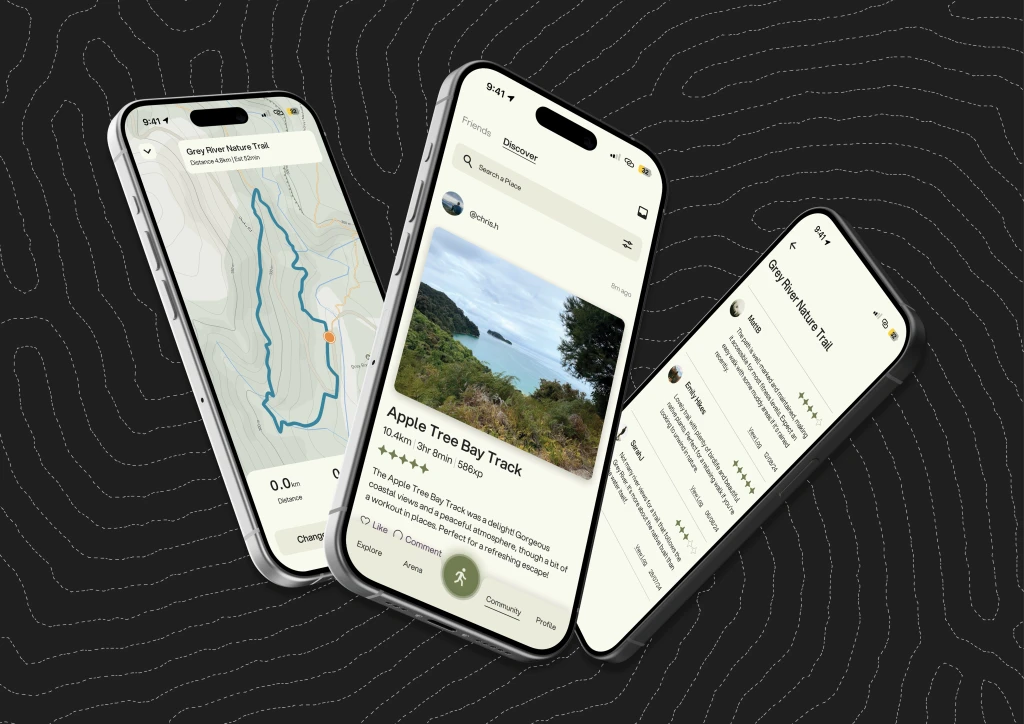
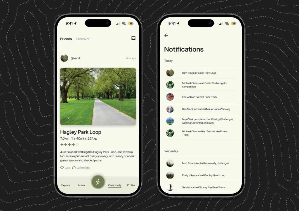

The UI and app user flows were developed in Figma iteratively from lo-fi to hi-fi interactive prototypes.


Finally, a project report was created outlining the design process and methodologies used throughout the UX process. Above are some spreads from the report(click to enlarge).